Posters
New York 2026
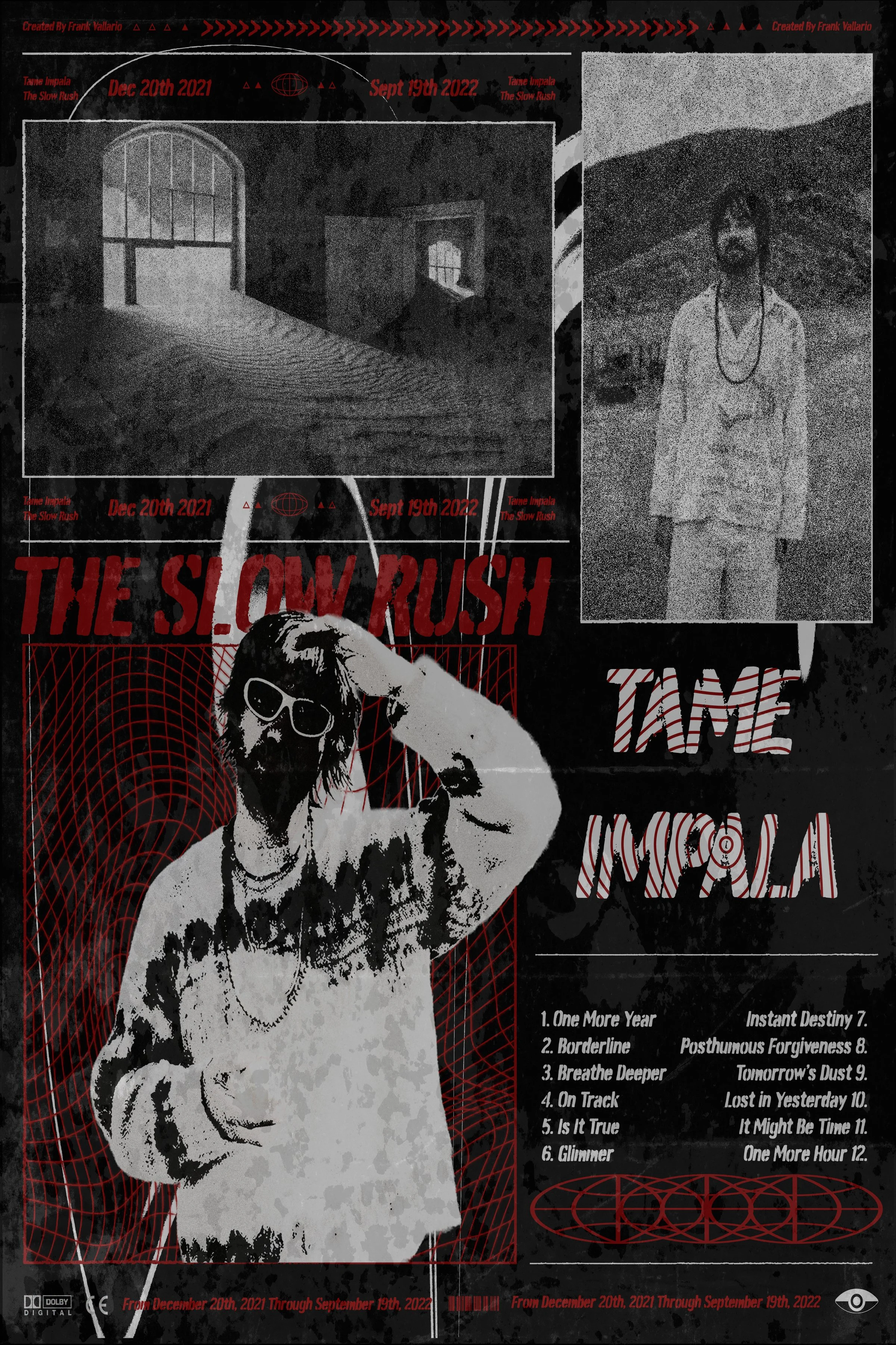
1. The Slow Rush / Tame Impala Poster: Rendered in a stark, high-contrast monochrome aesthetic, this piece layered classical portraiture with bold, stylized typography. The design heavily emphasizes raw line work, heavy shadows, and geometric framing accents to create a moody, psych-rock visual atmosphere. By pairing distressed textures with a structured multi-column track list, the artwork balances concert poster energy with a clean graphic hierarchy suited for promotional music media.
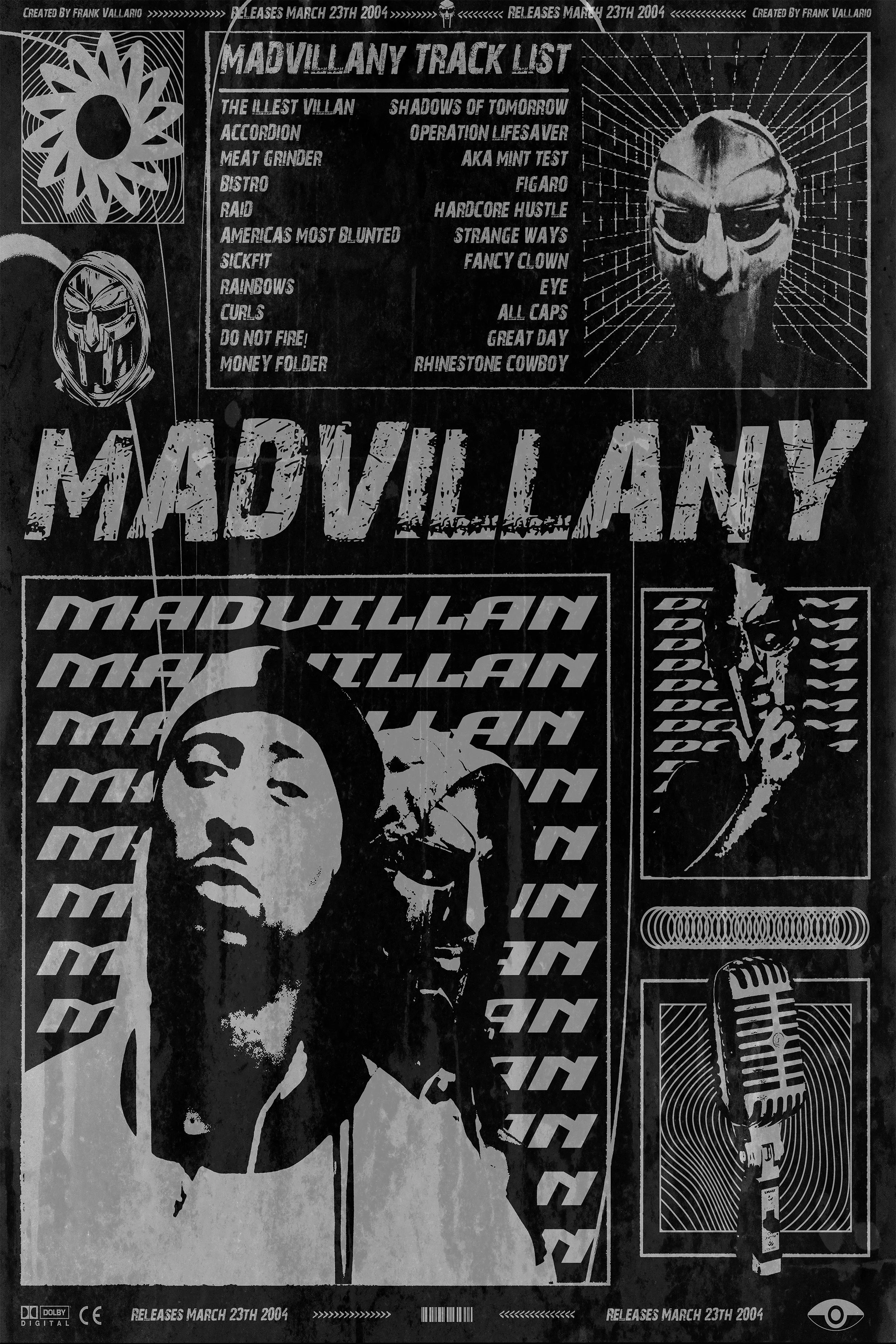
2. Madvillany Track List Poster: Rendered in a dense, dark graphic format, this piece organizes the album's track list into structured typography blocks and character illustrations. The layout uses high contrast white text against deep black panels to create a grid like aesthetic. Drawing inspiration from comic panel layouts and street art graphics, the poster captures the raw, underground energy of the hip-hop classic. It serves as an exploration of heavy text hierarchy, grid alignment, and iconic character portraiture.
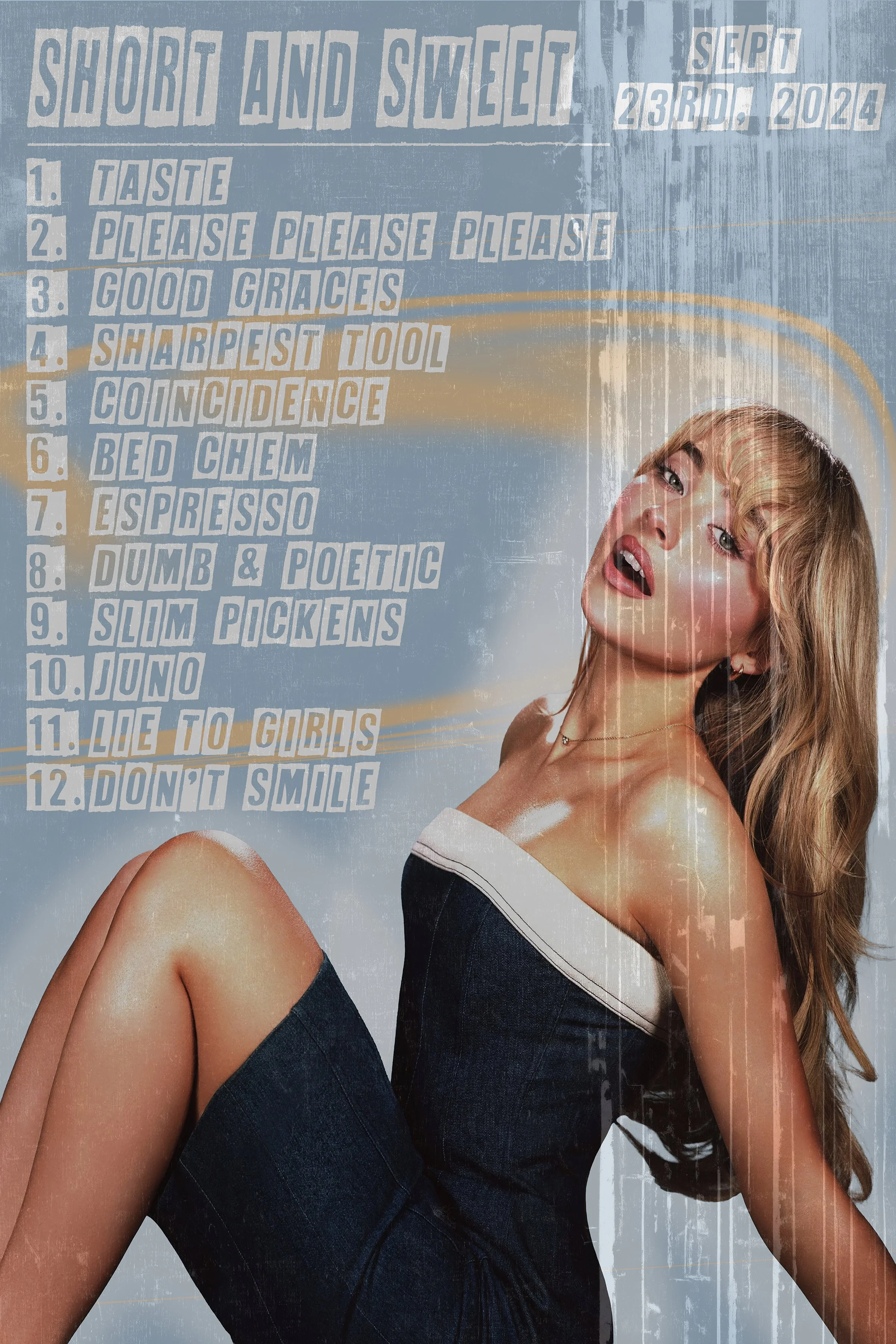
3. Short and Sweet Poster: Bathed in cool blue and neutral tones. This poster presents an itemized track listing using bold, shaded typography alongside photographic imagery. The light color palette and stacked text elements create an open, readable layout. The overall composition balances commercial pop aesthetics with structured graphic design. By combining layered photo cutouts with clean alignment, the artwork achieves a modern editorial feel suited for promotional music media.
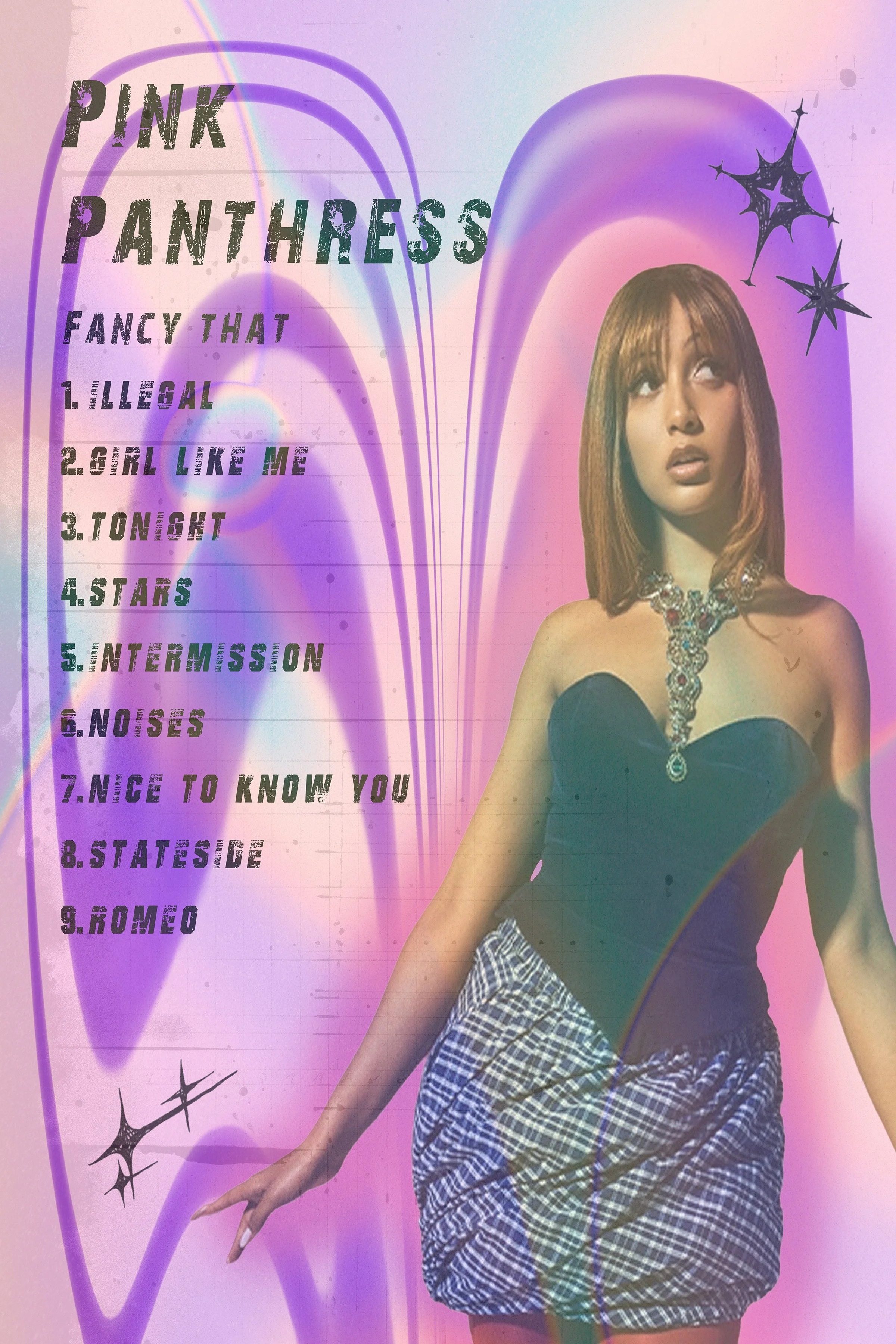
4. PinkPantheress Poster: Defined by vibrant purple and cyan gradients, this piece brings a soft, nostalgic Y2K aesthetic to the gallery layout. The glowing background frames the portrait and star accents, creating an energetic visual contrast. The typography uses clean vertical list alignment for the track names, letting the bold color palette and star graphics take center stage. It contrasts with the darker, high-contrast posters in the collection, offering a lighter visual entry.
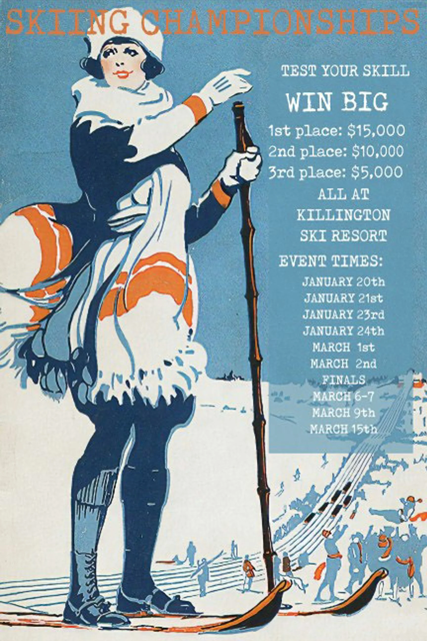

5. Skiing Championships Poster: Styled after vintage early to mid 20th century resort travel advertisements, this piece uses a classic gouache and ink aesthetic with soft cerulean blues, creams, and terracotta orange hues. The detailed illustration features a ski resort competitor in retro winter attire framing a layered event schedule, blending nostalgic athletic typography with heritage travel poster art.
6. Harbor & Oak Insurance Ad: Utilizing a modern editorial print layout, this advertisement combines warm automotive interior photography with crisp, high contrast serif typography. Designed around a direct narrative hook, the layout pairs clear service callouts and stats cards with yellow accent blocks, balancing commercial marketing principles with clean graphic design structure.
New Work!
-
![An image of the Cultural Center.]()
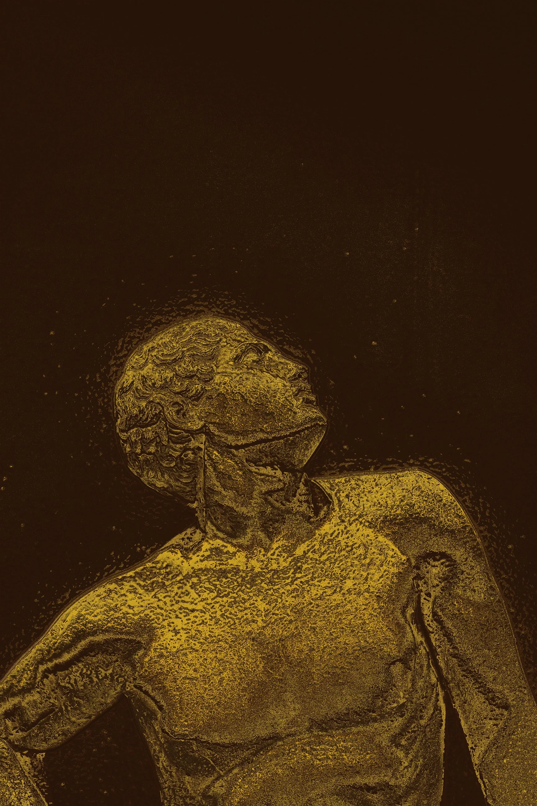
Talos I: Forged Bronze
Capturing rich golden undertones and a luminous metallic sheen, this piece references the divine alchemical process of Hephaestus fusing sacred metals to bring life to an unyielding construct. The warm, embers-and-gold lighting highlights the moment the divine spark ignited within the ancient automaton, bridging classical sculptural form with the mythical power of the forge.
-
![An image of the Cultural Center.]()
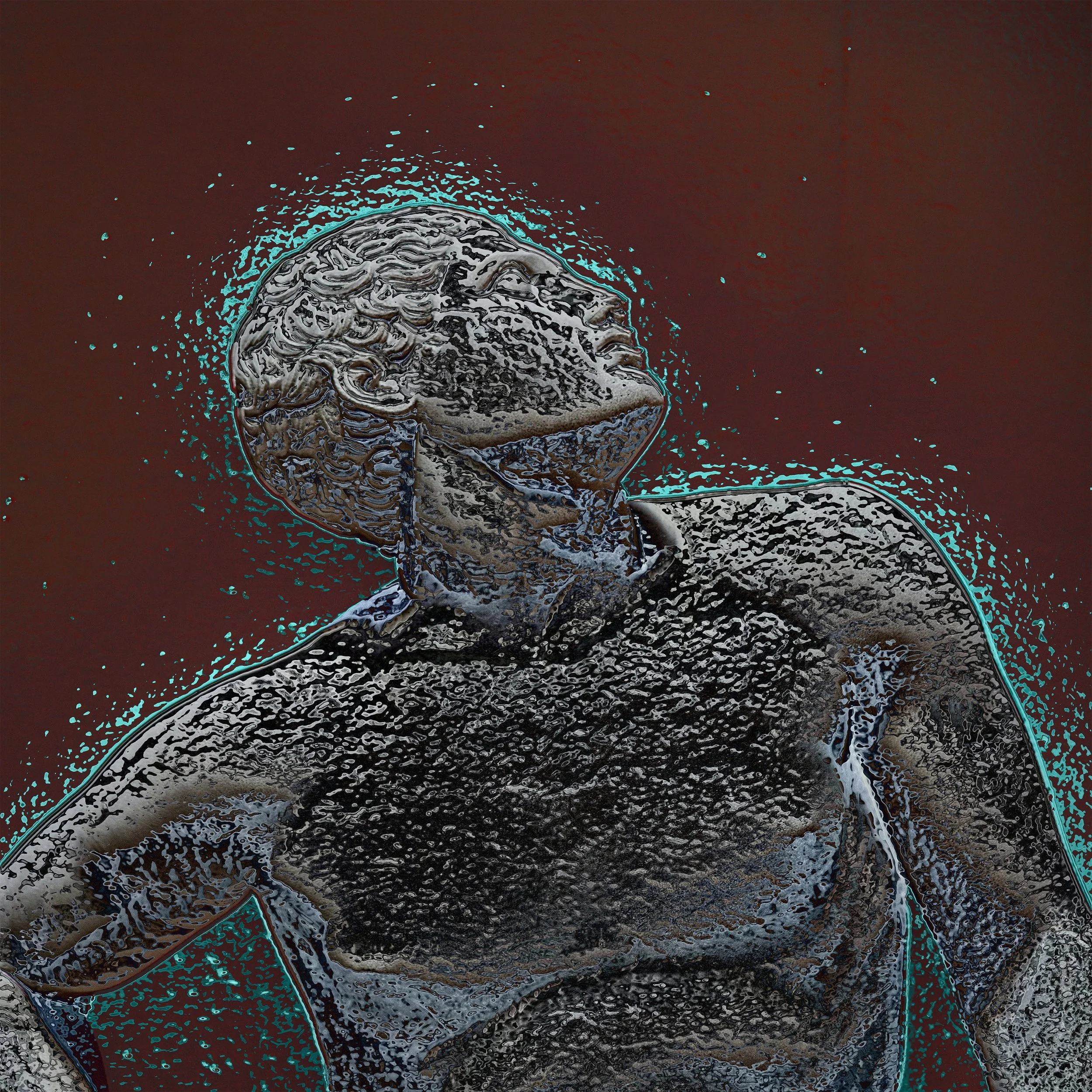
Talos II: Shores of Minos
Rendered in cool, silver grayscale metallic relief with high contrast surface grain, this variation emphasizes the physical weight and unyielding density of the giant. The design reflects the relentless duty of the automaton, who tirelessly patrolled the perimeter of Crete three times a day, hurling massive boulders at incoming enemy ships to maintain an impenetrable sea defense.
-
![]()
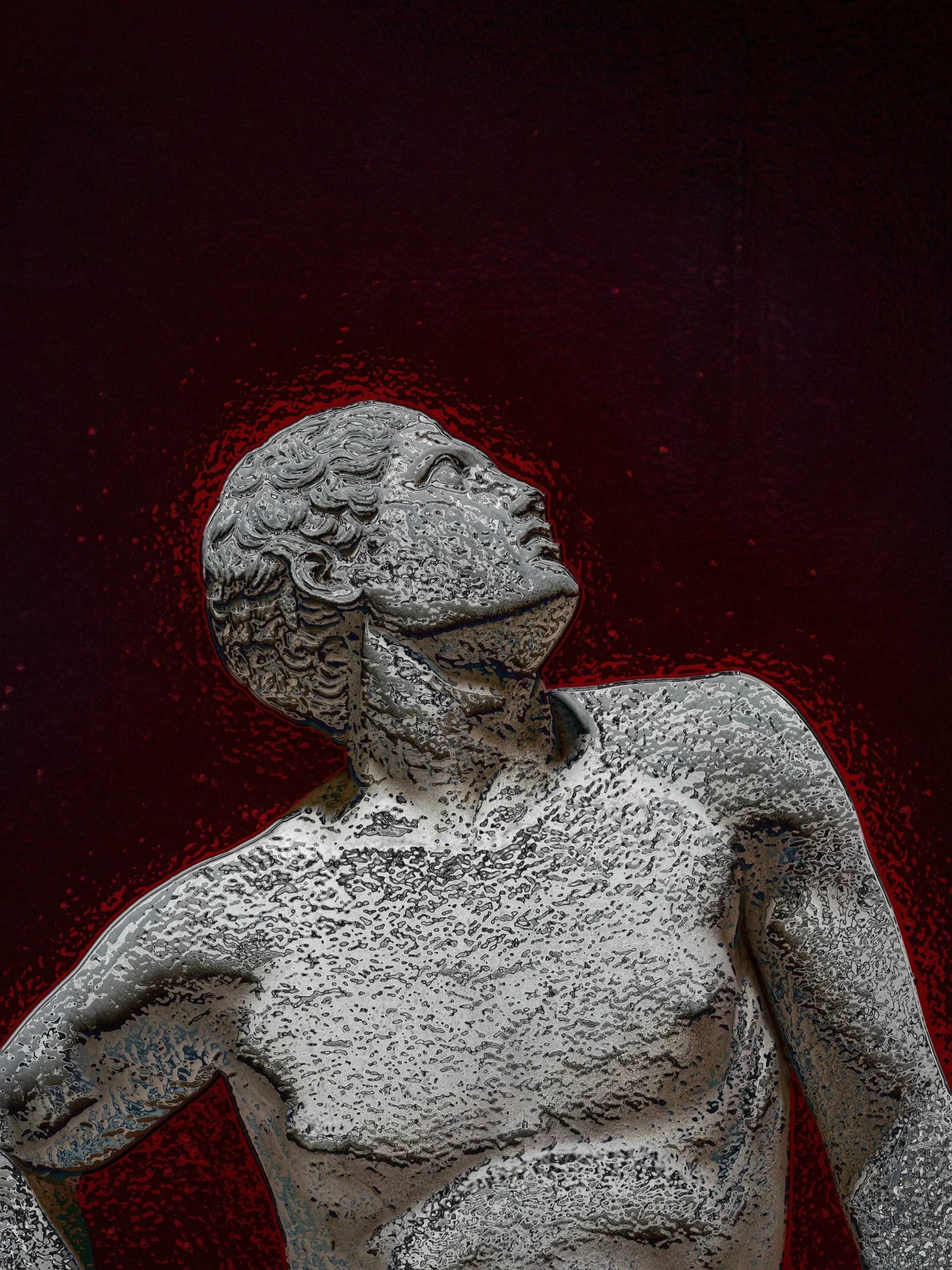
Talos III: Vein of Ichor
Framed by an intense crimson aura that radiates against dark surroundings, this piece focuses on the single internal conduit that powered the giant. Rather than blood, Talos was driven by ichor, the glowing, divine fluid of the immortals flowing through a single vein sealed with a bronze pin. The glowing red hue also references his terrifying ability to heat his metallic body red hot in combat to incinerate invading forces.
-
![Close-up of a dark, textured object on a surface with blue and teal accents, surrounded by scattered small teal particles.]()
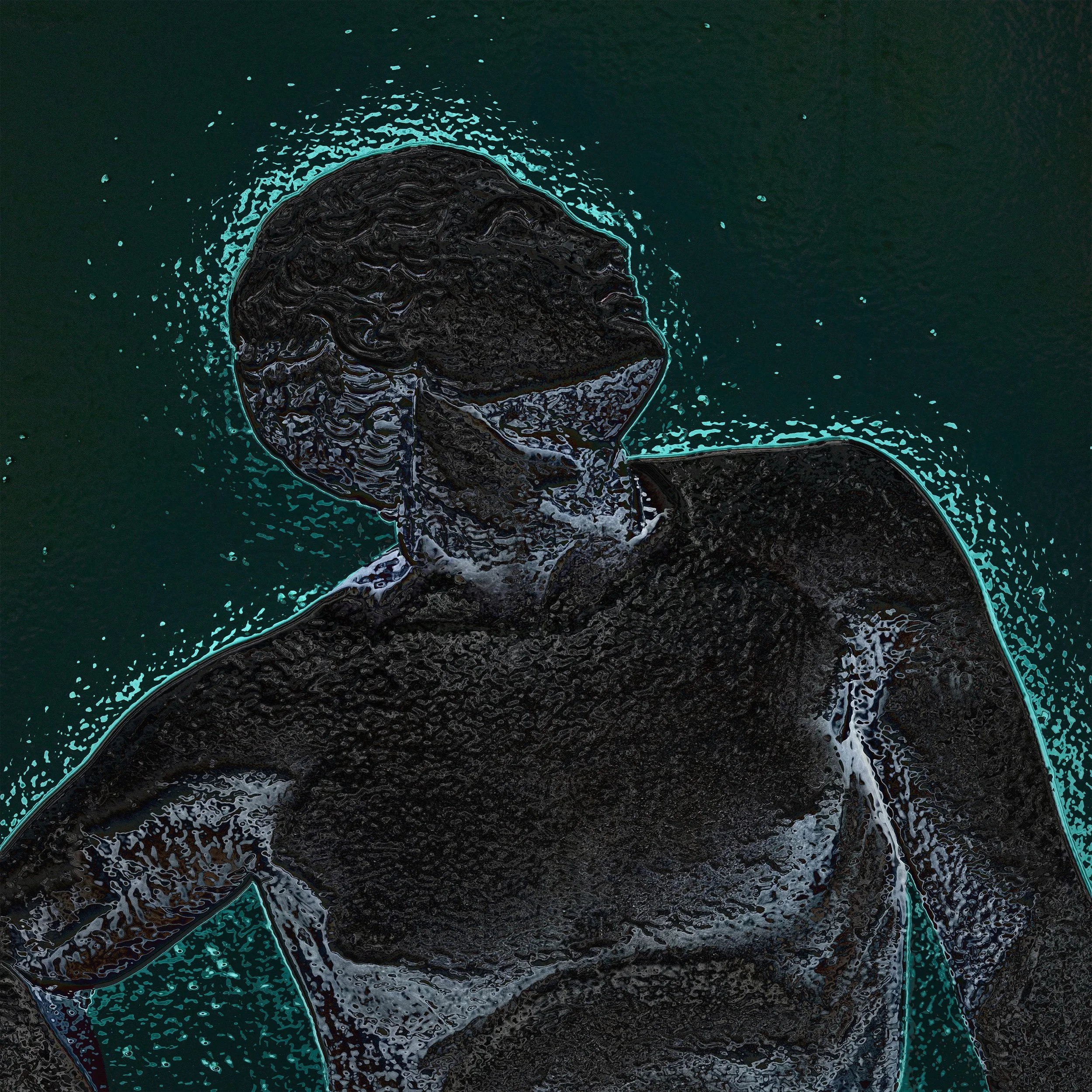
Talos IV:
Emerging as a textured silhouette wrapped in an electric teal aura, this piece captures Talos’s fall on the Cretan coast. Tricked by Medea, the bronze giant falters as his ankle pin slips, draining his divine lifeblood (ichor) into the Aegean waters. The bright cyan glow against the deep dark background marks both his fading power and the ocean taking him back.
-
![Contemporary artwork with a side profile of a person's face outlined in yellow, on a textured dark background with intricate geometric patterns.]()
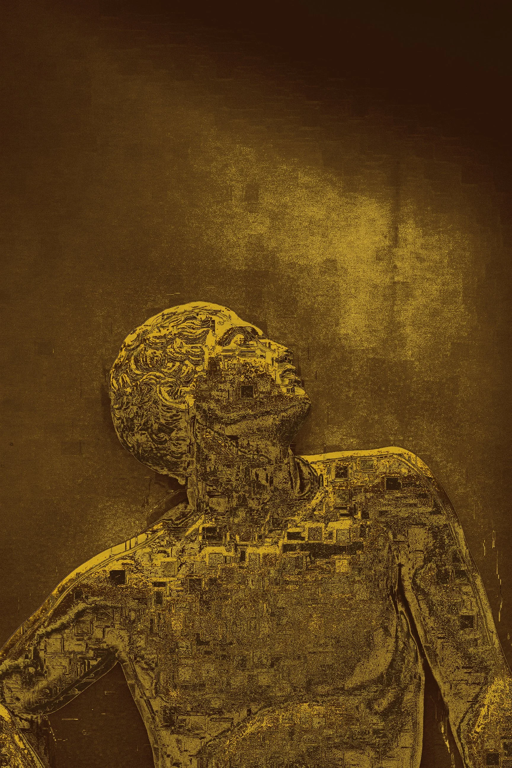
Talos V: Ichor Circitry
Overlaid with rich golden hues and an intricate digital circuit lattice across the torso, this piece reimagines ancient mythology through a modern cybernetic lens. It translates the mythical flow of divine ichor into a complex digital power grid, representing how ancient stories of autonomous machines parallel modern concepts of artificial intelligence, mechanical architecture, and digital engineering.